In the world of data analysis, visual representation is crucial for understanding complex trends, identifying patterns, and making informed decisions. Among the many tools available, the waterfall chart stands out as a powerful ally. It offers a clear and concise depiction of how various factors contribute to a final result. Let’s dive into the world of waterfall charts, exploring what they are, how they work, why they are important, and how they can transform your analytical insights.
What are Waterfall Charts?

A waterfall chart is a simple yet powerful data visualization tool available in all enterprise reporting solutions, including Microsoft Excel and Power BI. The waterfall chart is used to illustrate the cumulative effect of sequentially introduced positive or negative values. The chart resembles a series of columns with alternating positive and negative values, showing how each value contributes to the overall total. It is particularly useful for tracking changes over time or understanding the impact of different factors on a specific outcome. It is this last point, its ability to easily convey impact from different factors on the outcome, that makes this visual so powerful. It enables you to take action.
How Do Waterfall Charts Work?
Waterfall charts typically start with a baseline value, representing the initial state or starting point. Subsequent values are then added or subtracted in sequence, with each column in the chart representing the net effect of each factor. Positive values are usually depicted as columns rising above the baseline, while negative values extend below it. The final column in the chart represents the total outcome, showing the cumulative effect of all the values.
Why are Waterfall Charts Important?
- Clarity and Conciseness: Waterfall charts offer a concise visualization of complex data, making it easier to identify trends and understand contributing factors at a glance.
- Highlighting Contributions: By breaking down the components of a total value, waterfall charts highlight the individual contributions of each factor, helping analysts pinpoint areas of strength or concern.
- Detecting Trends and Anomalies: Changes in the direction or magnitude of the columns in a waterfall chart can reveal important trends or anomalies, guiding further analysis and investigation.
- Facilitating Decision Making: With a clear understanding of how different factors influence the final outcome, stakeholders can make informed decisions and take appropriate actions to achieve desired results.
A Simple Example with Visuals
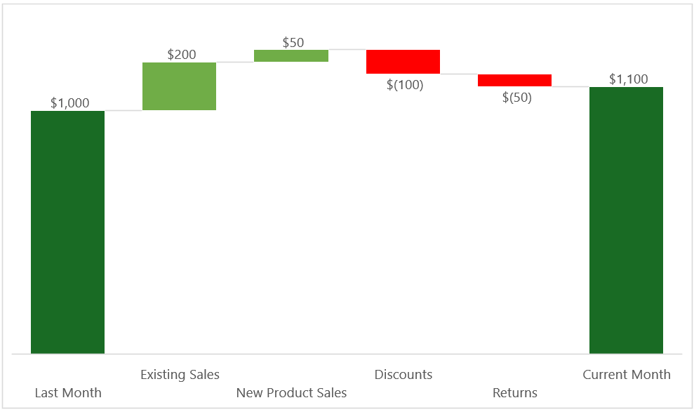
Let’s consider a hypothetical scenario where we analyze the monthly revenue of a retail business. Below is a simplified waterfall chart illustrating the factors contributing to the change in revenue from the previous month:

In this example:
- Far left. The baseline represents the revenue from the previous month.
- Positive values (green columns) represent factors that increase revenue, such as sales growth or new product launches.
- Negative values (red columns) represent factors that decrease revenue, such as discounts or returns.
- Far right. The outcome represents the revenue from the current month.
By examining the chart, we can see that while sales growth and new product launches contributed positively to revenue, discounts and returns had a negative impact, resulting in a net increase in revenue compared to the previous month.
Common Uses and Applications of Waterfall Charts
Waterfall charts are versatile and find applications across various domains due to their insightful visualizations. Here are some common uses:
- Financial Analysis: Waterfall charts are extensively used in financial analysis to track changes in revenue, expenses, and profits over time. They help identify the key drivers behind financial performance and highlight areas for improvement or optimization.
- Sales Performance Analysis: Sales teams utilize waterfall charts to analyze the factors influencing sales performance, such as changes in volume, pricing, discounts, and returns. By visualizing the contributions of different sales strategies or product categories, teams can adjust their tactics to maximize revenue.
- Profitability Analysis: Waterfall charts are valuable for assessing the profitability of products, services, or business units. By comparing revenue streams against associated costs and expenses, organizations can pinpoint areas of high or low profitability and make strategic decisions accordingly.
- Inventory Management and Supply Chain Analysis: In supply chain management, waterfall charts can illustrate changes in inventory levels, production output, and order fulfillment. By visualizing the flow of goods and materials through the supply chain, organizations can optimize inventory levels, minimize stockouts, and improve overall efficiency.
- Marketing Campaign Analysis: Marketing professionals leverage waterfall charts to evaluate the effectiveness of marketing campaigns and promotional activities. By tracking changes in website traffic, lead generation, conversion rates, and customer acquisition costs, marketers can assess the ROI of their marketing initiatives and allocate resources more effectively.
Conclusion
Waterfall charts are invaluable tools in the analyst’s arsenal, offering a visually compelling way to dissect complex data into a clear and intuitive format. Whether analyzing financial performance, evaluating marketing campaigns, or optimizing business processes, the ability to visualize the cumulative impact of sequential factors makes waterfall charts a valuable asset. By harnessing the power of waterfall charts, organizations can gain deeper insights, identify actionable opportunities, and drive meaningful business outcomes.
And that’s where our expertise comes into play. Let us help you transform your data into actionable insights with the power of waterfall charts.
Why Choose Solvenna for Your Analytics Needs?
- Expert Analysis: Our team of senior analysts don’t just crunch numbers – we interpret them. We go beyond the surface to provide you with actionable insights tailored to your business goals.
- Data Accuracy Assurance: We understand the importance of accurate data. Our meticulous approach ensures that the numbers you see reflect the true performance of your efforts.
- Customized Strategies: One size does not fit all. We craft pragmatic strategies based on your unique business needs and tailor our Analytics, Data Science, or AI solutions to drive tangible results.
- Transparent Reporting: We believe in transparent communication, providing you with clear, jargon-free reports that empower you to make informed decisions.
Ready to unlock more from your data? Let us be your guide. Contact us today to set up a brief call to further knowledge share and see if our expertise can help you unlock its full business potential.


